Creating my own brand with /slash

The image features a background with repeated yellow text saying 'QUEER' on a black background. On the left, the word 'QUEER' is vertically displayed in large red letters. To the right, there is a bright yellow starburst shape outlined in red.

Intro

In February 2024, I started a course called Brand Design. Throughout the course, we worked on a range of assignments, but the central project was clear: build your own brand from the ground up.

As a queer person, there are few things I feel more connected to than going out at night. That’s where /SLASH started.

/SLASH explores queer night culture as a space for storytelling, resistance, and connection. Think parties and raves but also poetry slams and strip clubs. There, it engages directly with the crowd and gives people space to speak. It amplifies voices that have too often been pushed into silence and broadcasts them to the world through social media.

Nightlife is often seen as a privilege and sometimes it is. But it is also an escape. For centuries, it has given marginalized communities a place to gather, to feel seen, and to exist freely. That is what I wanted to capture with this brand.

The loud colors, chaotic typography, sharp edges, and screaming language are not decorative. They are the message. That is /SLASH.

I could bore you with more words, or I could just show you the work. I made Campaign Posters, Logos and a complete Brand Identity Guide, which all perfectly encapsulate /SLASH.
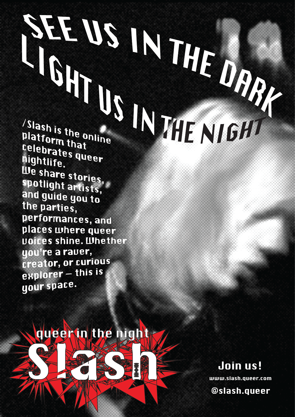
Black and white promotional poster for Slash, an online queer nightlife platform, featuring a close-up, out-of-focus image of a person's face with headphones. The poster includes the slogan "See us in the dark, light us in the night" and details about the platform with a red, spiky graphic behind the word "slash".

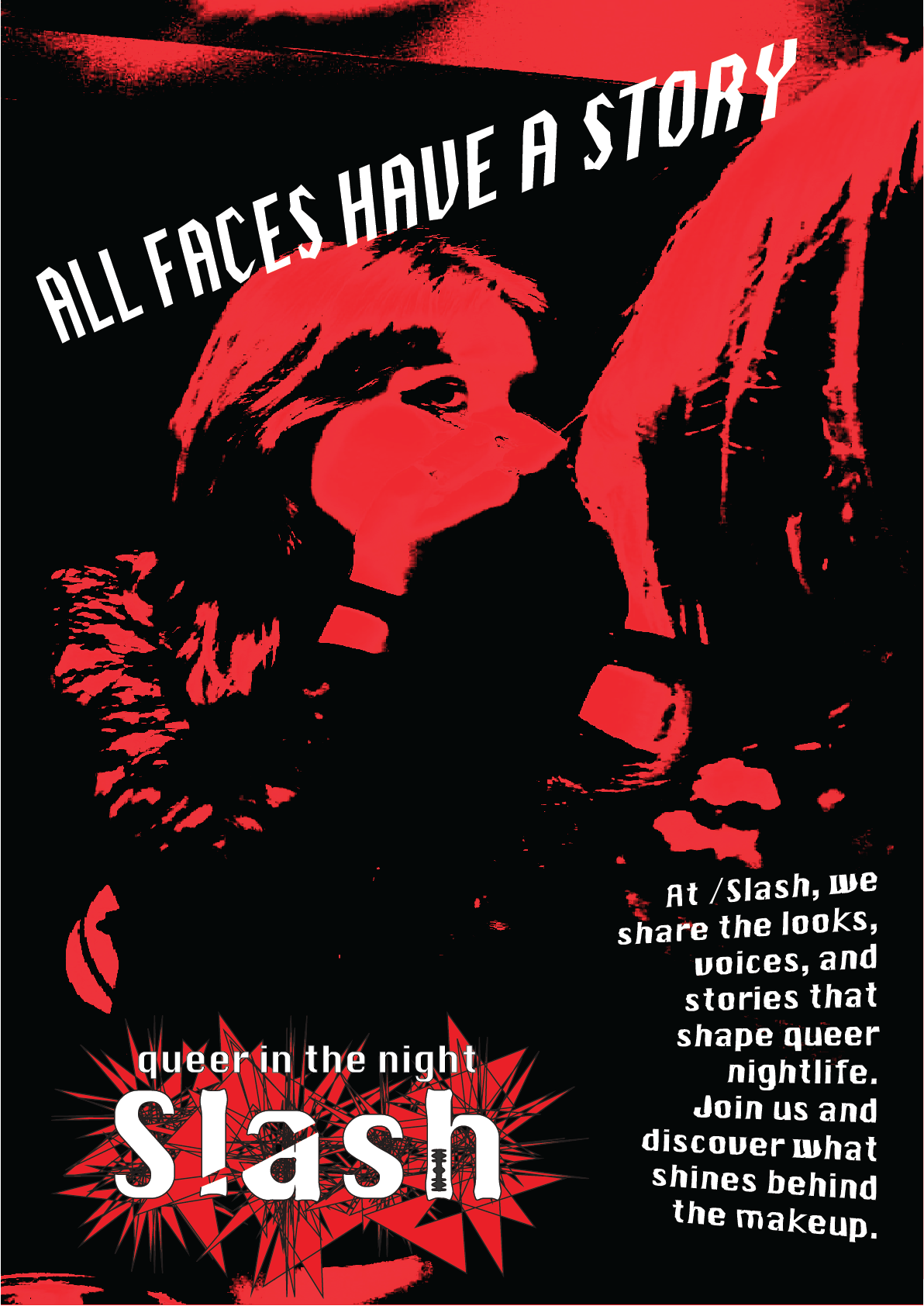
Campaign Posters

Poster for Slash Queer in the Night event featuring bold text and a stylized image of a person's face with makeup, promoting sharing looks, voices, and stories that shape queer nightlife.
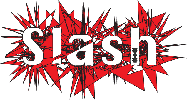
Text 'Slash' with an exclamation mark in place of the letter 'i', set against a red explosion graphic on a black background.

Logo

Abstract digital art featuring sharp red and black geometric spikes and lines on a black background.
Bold comic book style artwork with the word 'slash' over a background of colorful explosion shapes in red, blue, yellow, and black.
The word 'splash' written in bold, stylized letters with a comic book-style explosion background.

brand identity guide

Book cover with a yellow burst design, featuring red and pink text that says 'a brand insid, a brand, a brand, a brand inside, Queer in the night, Slash' and a handwritten name 'Selvia' at the bottom right.

The cover, backcover and first and last pages of the Brand Identity Guide are all risoprinted to emphasize Slash’s raw, imperfect character.
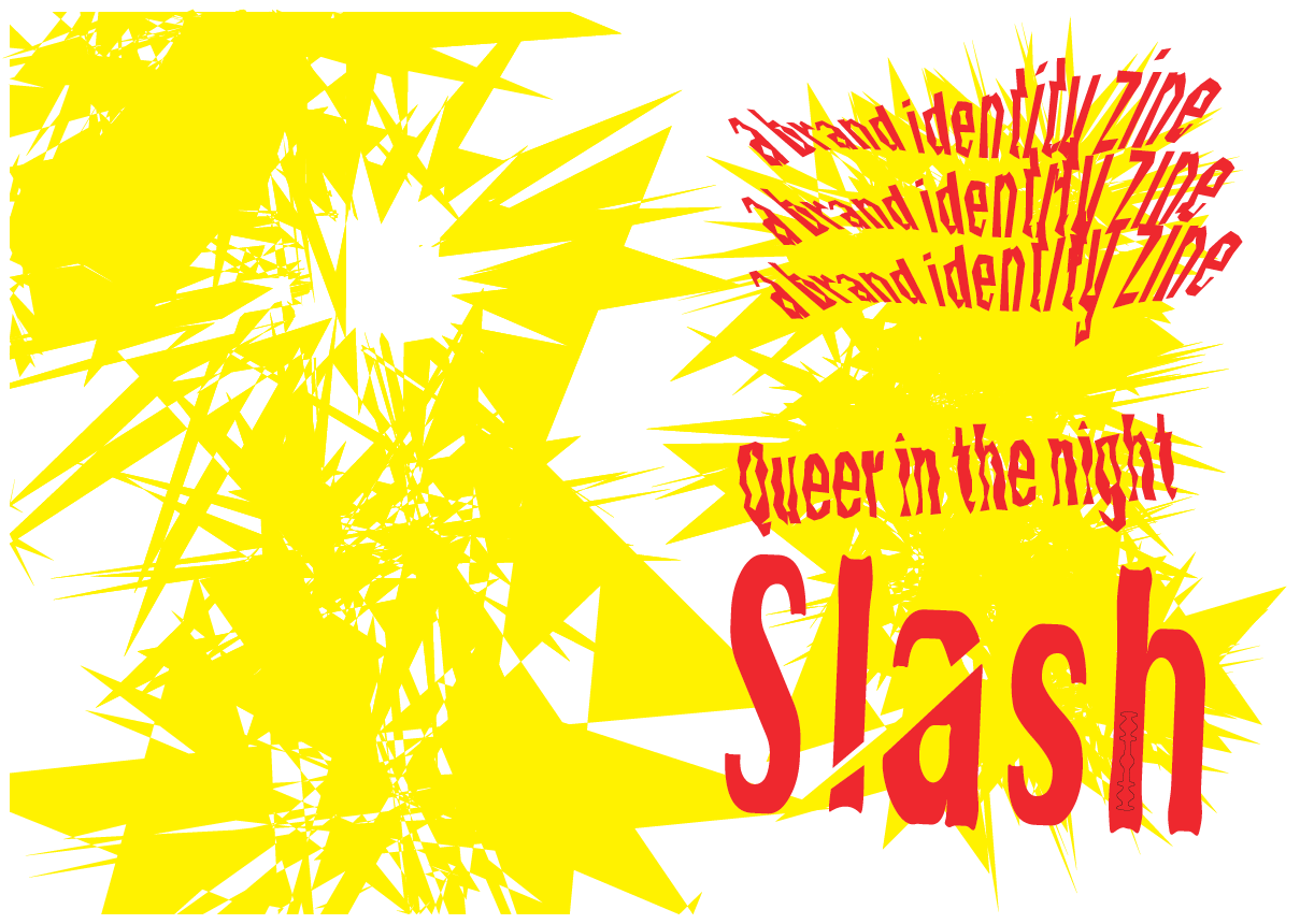
Abstract graphic with yellow and black jagged shapes and red distorted text that reads 'representation in the art and identity in the land and identity in the time and direct Queer in the night sash'.
Colorful graphic with the word 'QUEER' repeated in yellow text on a black background, large red text spelling 'QUEER' overlaying the repetition, and a yellow starburst shape with a red outline on the right side.

The rest of the pages truly define the Brand. It contains: the brand core, the tone of voice, the target audience, the brand book, the activities, a auote, a guerrilla marketing action and the reason why it exists. All in this FIGMA-made brand identity guide.